
Scope of work
• Logo • Color Palette • Typography • Digital Assets • Print • Stationery • Reports
Client
Erchis Ugalz
Industry
Finance
Design Focus
Logo
Visual Identity
Digital Assets
Poster
Duration
3 Weeks


The Backstory
The Backstory
The Backstory
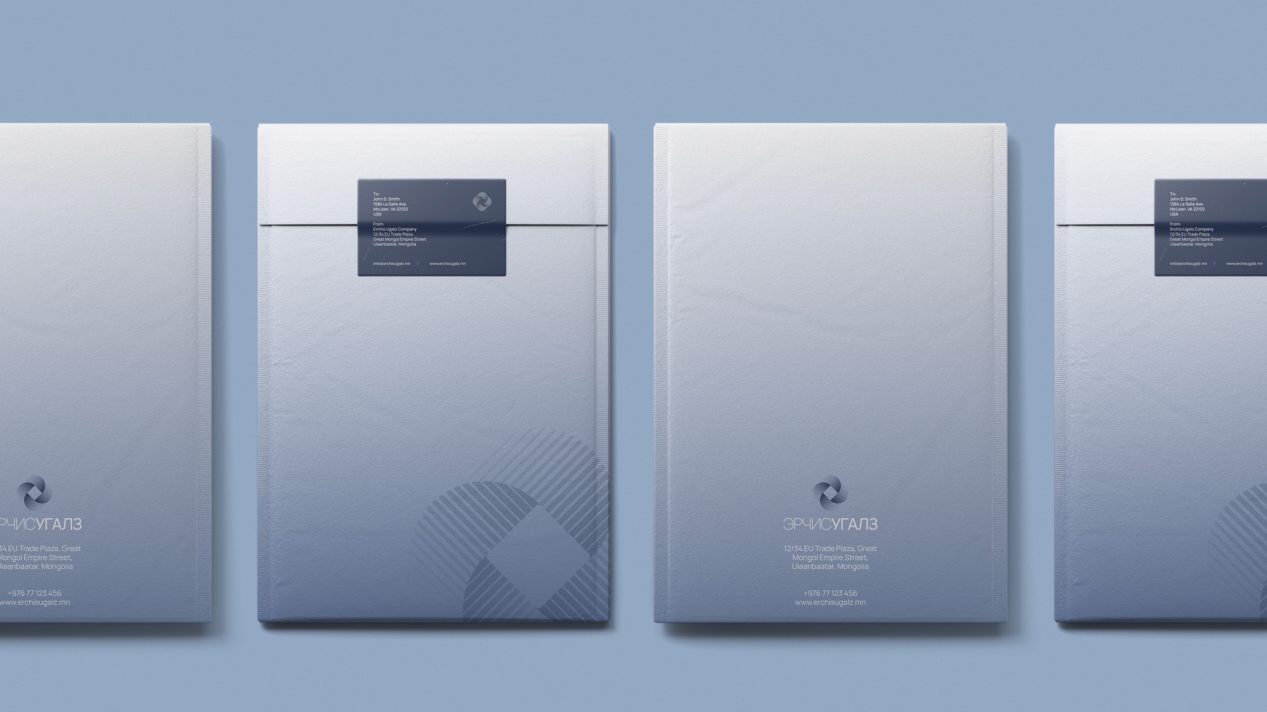
Collective Motion, Cross-Cultural Precision: The Identity of Эрчис Угалз As Mongolia’s economy accelerates and diversifies, a new kind of financial entity has emerged—one that fuses investment capital with strategic consultancy, and local insight with international standards. Эрчис Угалз, founded by four partners including a key Japanese investor, was launched to empower businesses through funding, guidance, and long-term collaboration. To articulate this vision, Redefined™ was commissioned to build a brand identity from the ground up—one that would convey credibility, unity, and motion across borders. The resulting logomark is a geometric abstraction of wind in motion—specifically, the spiraling energy of a desert storm. Constructed from four identical, interlocking units, the mark reflects the equal footing and shared vision of its founders. The negative space at the center evokes ancient coinage—a subtle nod to value, trade, and economic flow—while the radiating structure suggests a force that is both grounded and dynamic. Diagonal line textures introduce kinetic rhythm, symbolizing shifting currents, sand trails, and momentum—visual metaphors for adaptability and guidance in uncertain terrain. The entire form is rotated 45°, enhancing the sensation of progress and forward movement, and breaking away from static, institutional tropes. The logotype, set in the Manrope typeface, offers multilingual clarity and modularity. It subtly differentiates the compound name through typographic weight, preserving both hierarchy and unity. In Japanese applications, the system extends with Kozuka Gothic—a refined sans-serif that supports brand consistency across cultural contexts. Color plays a strategic role: soft neutrals paired with corporate blues suggest clarity, calm authority, and depth. The palette, typography, and compositional system come together in a range of applications—from investment reports and advisory materials to digital interfaces and corporate environments. Ultimately, the Эрчис Угалз identity embodies more than just design—it signifies movement with direction, structure with openness, and finance with purpose. It positions the company as a trusted partner in shaping the next wave of Mongolian enterprise—bold, precise, and internationally attuned.
Collective Motion, Cross-Cultural Precision: The Identity of Эрчис Угалз As Mongolia’s economy accelerates and diversifies, a new kind of financial entity has emerged—one that fuses investment capital with strategic consultancy, and local insight with international standards. Эрчис Угалз, founded by four partners including a key Japanese investor, was launched to empower businesses through funding, guidance, and long-term collaboration. To articulate this vision, Redefined™ was commissioned to build a brand identity from the ground up—one that would convey credibility, unity, and motion across borders. The resulting logomark is a geometric abstraction of wind in motion—specifically, the spiraling energy of a desert storm. Constructed from four identical, interlocking units, the mark reflects the equal footing and shared vision of its founders. The negative space at the center evokes ancient coinage—a subtle nod to value, trade, and economic flow—while the radiating structure suggests a force that is both grounded and dynamic. Diagonal line textures introduce kinetic rhythm, symbolizing shifting currents, sand trails, and momentum—visual metaphors for adaptability and guidance in uncertain terrain. The entire form is rotated 45°, enhancing the sensation of progress and forward movement, and breaking away from static, institutional tropes. The logotype, set in the Manrope typeface, offers multilingual clarity and modularity. It subtly differentiates the compound name through typographic weight, preserving both hierarchy and unity. In Japanese applications, the system extends with Kozuka Gothic—a refined sans-serif that supports brand consistency across cultural contexts. Color plays a strategic role: soft neutrals paired with corporate blues suggest clarity, calm authority, and depth. The palette, typography, and compositional system come together in a range of applications—from investment reports and advisory materials to digital interfaces and corporate environments. Ultimately, the Эрчис Угалз identity embodies more than just design—it signifies movement with direction, structure with openness, and finance with purpose. It positions the company as a trusted partner in shaping the next wave of Mongolian enterprise—bold, precise, and internationally attuned.

